Tuesday 20 October 2015

Evaluation for Cover Magazine


EVALUATION

  1. Who would be the audience for your media product? 
  2. How did you attract/address your audience? 
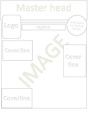
The bold Masthead is convention for a magazine to appealing to the audience , this will also helps the Masthead stand out more, and look more eye-catching.  This is expected to appear on the top of the front page due to informing the audiences as soon as they look at the masthead, about what the genre the magazine is. I used a layout to set out the way my magazine cover is presented, however I changed a few things such as, putting cover lines in the spaces mini images should be, this is because the magazine then gives away more information about what inside the magazine. I also decided to change to image of the cover, as the current image has more of a background to it which makes the front cover appealing. I have used to colors red and black, because its the color scheme for the school and therefore fits in with the theme of magazine. 
The front cover features main image, and cover lines based around one side of the page. 
The audience for my media product would be the students who go to Plantsbrook school. This is because it provides information about activities that run in the school, also gives away advice. I attract my audience by using bright colors in the title, and cover lines. This would attract audience because they the viewer will not get bored, as its colorful, but also linked to the school theme, as red, black and white is used quite a lot. To avoid confusion between my anchorage and cover line, I changed the sizing of my text, some being smaller and other larger. My final magazine challenges the convention of the text font has to be formal. I choose to do informal because it would attract my audience more. 

Feedback


This feedback sheet shows what my teacher thinks about blog, also it gives me things to improve on, and picks out the things that I have done well. At the bottom, I have set myself some targets about how I could make my blog better.

Pb magazine Front Cover and Contents Page


This is my final cover for my school magazine, which I created on fireworks. I used different tools and effects to make it look appealing to the audience. 


Monday 19 October 2015

Survey Monkey Questionairre

School magazine survey

This is a questionnaire for my target audience, to help me create the best magazine cover, for what appeals to the audience , and get some good feedback, so i can adapt from it.


https://www.surveymonkey.com/r/G9VXKW8


Survey Monkey Results

In my survey results, 50% of the audience picked the cover which I have now used in my design. I have decided to combine all of the different results and put together one magazine cover, which is why I altered some of the positioning of where things go on the cover (E.G.cover lines, main image)This way the majority of the audience will be pleased, as its a mixture of features. On question two, 4 in 10 people said they proffered the colour scheme of red, black and white, which is understandable as the main colour scheme of the school is red, black and white. However some of the audience choose random colours, so I decided to fit in few other colours, so the cover looks more interesting, and eye catching.
The vast majority of the people that took the survey preferred the masthead "Edition "instead of the masthead "Plantsbrook News", This could be because PB edition is much more informal, and so would attract more attention.
Most of the results for question 6, resulted in 100% of the audience choosing, "yes", that the main image should be of a student. From this I learnt that the most attractive magazines are the ones which have an image of students or students on the front cover.
95% of the audience said the fonts are suitable which are chosen for the magazine, as they are not too informal but not too formal.

Overall all of my market research helped me a lot in understanding what I should choose to make my magazine cover look as professional as I can, so it would appeal to more people.


Tuesday 13 October 2015

final choice draft (Cover Magazine)


This is my final cover magazine which Im going to use. I choose this one because, It involves alot of different cover lines and images that could attract audiences' attention. 
The different colors could appeal more the students which is why this magazine cover would be a good choice. 
the font style of the master head is unique and short, also informal, so the reader's first impression of the cover wont  be boring. 

Tuesday 6 October 2015

Cover magazines 2 more

 These are my other two magazine covers for a school magazine.
I have used a layout from one of my drafts, and added different colors to make it look more appealing to audience. I have used a variety of colors so it would appeal to both girls and both.


On the magazine cover I have make it more formal, as the target audience is parents, not children. I still added colors so it doesn't bore the reader, but the cover-lines lines are more suitable for adults rather than children. 

front cover layouts


These are drafts of my school 
magazine layouts. I have used 
some different shapes to
make the layout look more 
presentable. 


                                                                                 In some of the draft layouts I                                                           have put overlapped the  cover lines,                                                 over the image, to make it look  more                                                    informal and presentable for the                                                           audience


Monday 5 October 2015

magazine cover draft


This is my first hand drawn magazine cover draft. Around the sides I have put the cover lines, to tell the audience what to expect inside.
I used different colors so it would look attractive and eye catching.

In the master-head i used red and green colors, this is because they are the schools mains colours, then for the "magazine" sign, I used orange. These colours are all unisex colours, so would attract males and females. 

magazine masterheads


These are three different mastheads I could possible use for my school magazine.
I used all these-different types of color because by making the master head colorful, it will attract audiences attention better. Also because school is associated with young teens and children, The master head shouldn't be boring and dull. 

1) The first master head states "PB" instead of the full name of the school "plantsbrook", I did because its more informal. I also used a funky type of writing to attract students attentions . 

2) The second master head would be aimed at the younger teens who like simple. The colors used a bright and luminous, so its brighter and colorful.  

3) The third master head could be aimed at parents, and the writing is simple and bubbly. But theres no colours used, Only subject names in the writing. 

Friday 2 October 2015

Portrait Photography

Portrait Photography


The following slideshows gives several different pictures, of my portrait photography. I used a standard camera to take these shots around the school, As you can see, some are long shot. short shots, and medium shots. This gives the viewer a variety of images to look at, It also shows I am capable of taken different types of pictures which could possibly be used in a school magazine, or on the cover of one. 

Photography Part 1


Created with flickr slideshow.
This is a slideshow of the first lesson of photography. We went around the school and toke pictures of different things that could be involved in a school magazine.